
 Bitcoin: HODL Waves
Zoom in with touchscreen: Touch and hold with ONE finger then drag.
Zoom in on desktop: Left click and drag.
Reset: Double click.
What are Bitcoin HODL Waves?
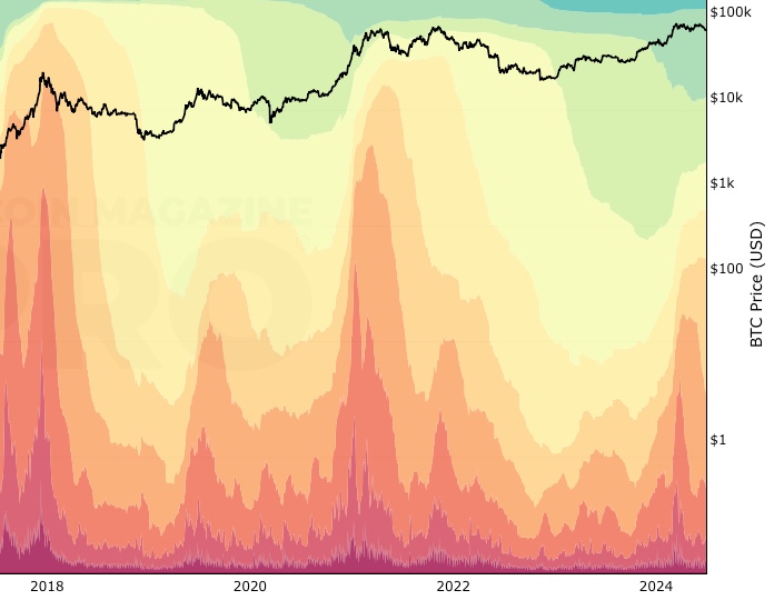
HODL Waves is a Bitcoin chart that uses blockchain data to show the amount of bitcoin in circulation grouped into different age bands. It uses different colors to show the various age bands and how the amount of bitcoin in each of the bands changes over time, creating wave-like patterns on the chart.
It shows the total supply of bitcoin in the market at any given time by normalizing the supply distribution. Therefore the Y-axis on the chart goes up to 100% as it is showing the age breakdown of all bitcoin on a given date.
What do HODL Waves Show?
This visualization highlights what different market participants are doing with their bitcoin. For example, when we see sharp increases in lower age coins being held, this indicates that a lot of older bitcoins are being sold by people who have held them for a long time, and are now being bought up most likely by new participants in the market.
Historically, this tends to happen when the price of Bitcoin is moving up very fast and new participants are rushing into the market to buy, close to market tops. Take a look at the chart above and you will see that the younger age bands, which are shades of red, tend to spike up when price climbs too fast before topping out and then moving down into a bear market.
This is a visualization of FOMO (fear of missing out). Often the price of Bitcoin then retraces quite sharply afterward, which can be costly for those who jumped into the market late in the cycle.
The HODL Waves chart can help us to understand the Bitcoin market cycles and this process of older, more experienced players in the market selling when prices are high to newer participants - which is what creates the sharp spike in the red-colored bands as $BTC approaches its cycle tops.
How are HODL Waves Calculated?
The HODL Waves Bitcoin chart is calculated by analyzing blockchain data. This process is known as onchain analysis.
In the specific analysis to create the HODL Waves chart, we look at when bitcoins were last moved between wallets, and group the amount of them by different age bands shown on the key of the chart. They are:
- 24hr
- 1 day - 1 week
- 1 week - 1 month
- 1 month - 3 months
- 3 months - 6 months
- 6 months - 12 months
- 1 year - 2 years
- 2 years - 3 years
- 3 years - 5 years
- 5 years - 7 years
- 7 years - 10 years
- +10 years
The technical term for the above process is tracking UTXO (unspent transaction outputs) by different age groups. You can learn more about UTXOs in this post from the Learning Section of Look Into Bitcoin titled UTXOs Explained.
How is the HODL Waves Bitcoin Chart useful?
The HODL Waves chart shows the amount of bitcoin held for different periods of time. This is useful because it can show what different groups of people in the market are doing. These groups can be simplified down to long-term holders and short-term holders.
The long-term holders are often regarded as ‘smart money’ because they are more experienced in the Bitcoin market in terms of when to buy and sell $BTC. By definition, we know that they are likely to hold older coins which are the cooler colors on the chart - blues, purples, greens. So if we see the size of those color bands on the chart reduce, we know that the longer-term ‘smart money’ players are selling their bitcoin.
As an astute investor using this chart, it may well give a clue that the price of Bitcoin may soon top out on a macro time horizon. This has certainly been the case when looking over Bitcoin’s history on the chart.
It can therefore be used as a broad Bitcoin price prediction tool as it shows when the price of Bitcoin may be going too high in a bull market and may soon reach a price top.
We created a very simple way to track this over time that uses just one of the age bands. We highlighted coins that had been held for at least 1 year and created a new Bitcoin live chart called the 1yr HODL Wave chart. The 1yr HODL wave line has an inverse relationship to price which again highlights that long term participants start to sell their bitcoins as the $BTC price increases over time.
Created By
The original HODL waves concept was developed by Dhruv Bransal of Unchained Capital.
Date Created
April 2018
Fall Further Down The Rabbit Hole
You can read the original article Bitcoin Data Science Part 1: HODL Waves to read about the original analysis for HODL Waves.
Similar Bitcoin Charts That You May Find Useful
The 1yr HODL Wave chart shows a very specific view of HODL Waves by isolating bitcoin held for more than 1 year as a proxy for ‘smart money’ with a long-term view.
The RHODL Ratio uses the HODL Waves concept but applies Realized Cap on top of it and applies a ratio. By doing this it is able to show when there is euphoria in the market and it has historically identified major cycle highs in Bitcoin price.
You May Also Be Interested In
Supply Adjusted Coin Days Destroyed
Number of coins multiplied by days since those coins last moved on-chain, adjusted for bitcoin supply.
Realized Cap HODL Waves
The cost basis of UTXO’s held within specific age bands.
Whale Shadows (aka Revived Supply)
Onchain tracking of old coins moving again in large amounts.
Make smarter decisions about Bitcoin. Instantly.
Access the Bitcoin and Global Macro Charts that really drive Bitcoin’s price.
+40 chart alerts. Never miss critical levels on charts again.
Analysis newsletter. Manage your emotions at market extremes.
Private Tradingview indicators. See Bitcoin chart levels in real time!
Cancel anytime.
Any information on this site is not to be considered as financial advice. Please review the Disclaimer section for more information.