
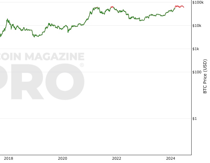
 Bitcoin: Bitcoin Investor Tool: 2-Year MA Multiplier
Zoom in with touchscreen: Touch and hold with ONE finger then drag.
Zoom in on desktop: Left click and drag.
Reset: Double click.
Indicator Overview
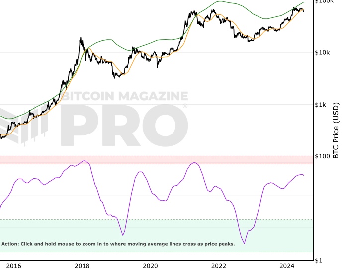
The 2-Year MA Multiplier is a bitcoin chart intended to be used as a long term investment tool.
It highlights periods where buying or selling Bitcoin during those times would have produced outsized returns.
To do this, it uses a moving average (MA) line, the 2yr MA, and also a multiplication of that moving average line, 2yr MA x5.
Note: the x5 multiplication is of the price values of the 2yr moving average, not of its time period.
Buying Bitcoin when price drops below the 2yr MA (green line) has historically generated outsized returns. Selling Bitcoin when price goes above the 2yr MA x 5 (red line) has been historically effective for taking profit.
Why This Happens
As Bitcoin is adopted, it moves through market cycles. These are created by periods where market participants are over-excited causing the price to over-extend, and periods where they are overly pessimistic where the price over-contracts. Identifying and understanding these periods can be beneficial to the long term investor.
This tool is a simple and effective way to highlight those periods.
Bitcoin Price Prediction Using This Tool
The Bitcoin Investor Tool can be used to indicate whether the price of Bitcoin today is at levels that are historically low (in the green zone) or high (in the red zone) or neutral (between the green and red zones). So it is a useful tool for Bitcoin price prediction as investors can understand on a historically relative basis whether $BTC is currently over or undervalued. This can be helpful when forecasting the price of Bitcoin.
Created By
Philip Swift
Date Created
July 2017
Fall Further Down The Rabbit Hole
Philip Swift on Twitter
Similar Live Charts That You May Find Useful
The Bitcoin Investor Tool attempts to identify when the market is overly excited or overly fearful. When price breaks up into the red band it suggests that the market is, generally speaking, very excited about Bitcoin which is pushing the price up to levels that may be unsustainable. The inverse is true, when price drops into the green zone the market is generally fearful and/or apathetic about Bitcoin and its price. It does this at a macro, high time frame level.
Another tool that does this but on lower time frames is the Fear and Greed Index. It uses a different approach but attempts to identify a similar thing, extremes in market sentiment. You can view it here.
For an on-chain tool that looks at the very extremes of market sentiment, take a look at MVRV Z-Score.
You May Also Be Interested In
Bitcoin Profitable Days
The proportion of days in Bitcoin's traded history that it has been profitable to hold Bitcoin
Pi Cycle Top & Bottom Indicator
Pi Cycle Top and Bottom Indicator.
Stock-to-Flow Model
Ratio of bitcoins in circulation relative to the amount of bitcoins annually mined, and this ratio's relationship with price
Make smarter decisions about Bitcoin. Instantly.
Access the Bitcoin and Global Macro Charts that really drive Bitcoin’s price.
+40 chart alerts. Never miss critical levels on charts again.
Analysis newsletter. Manage your emotions at market extremes.
Private Tradingview indicators. See Bitcoin chart levels in real time!
Cancel anytime.
Any information on this site is not to be considered as financial advice. Please review the Disclaimer section for more information.