
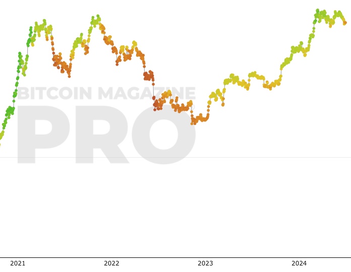
 Bitcoin: 200 Week Moving Average Heatmap
Zoom in with touchscreen: Touch and hold with ONE finger then drag.
Zoom in on desktop: Left click and drag.
Reset: Double click.
Indicator Overview
In each of its major market cycles, Bitcoin's price historically bottoms out around the 200 week moving average.
This indicator uses a colour heatmap based on the % increases of that 200 week moving average.
Depending on the month-by-month % increase of the 200 week moving average, a colour is assigned to the price chart.
Note: this is a slightly modified version of a concept created by @100trillionUSD. Use the link below to learn more about the original.
How It Can Be Used
The long term Bitcoin investor can monitor the monthly colour changes. Historically, when we see orange and red dots assigned to the price chart, this has been a good time to sell Bitcoin as the market overheats. Periods where the price dots are purple and close to the 200 week MA have historically been good times to buy.
Bitcoin Price Prediction Using This Tool
If you are looking to predict the price of Bitcoin or forecast where it may go in the future, the 200WMA heatmap can be a useful tool as it shows on a historical basis whether the current price is overextending (red dots) and may need to cool down. It can also show when Bitcoin price may be good value on a historical basis. This can be when the dots on the chart are purple or blue.
Over more than ten years, $BTC has spent very little time below the 200 week moving average (200WMA) which is also worth noting when thinking about price predictions for Bitcoin or a Bitcoin price forecast.
Created By
Plan B - @100trillionUSD
Date Created
January 2019
Fall Further Down The Rabbit Hole
Similar Live Charts That You May Find Useful
The 200WMA is a very simple tool that identifies when the price of $BTC is accelerating too fast, which can highlight unsustainable periods of FOMO (fear of missing out) in the market. This tool can therefore allow an investor to separate their emotions from the market emotions and manage risk appropriately. Other charts on this site such as the Fear & Greed Index or Puell Multiple are also effective tools for understanding when market participants are overly fearful or greedy.
You May Also Be Interested In
Fear And Greed Index
Market sentiment tool gauging investor fear and greed over time.
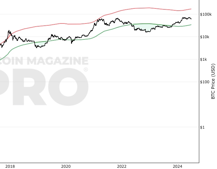
Bitcoin Investor Tool: 2-Year MA Multiplier
Long timeframe investor tool to identify under/oversold price periods
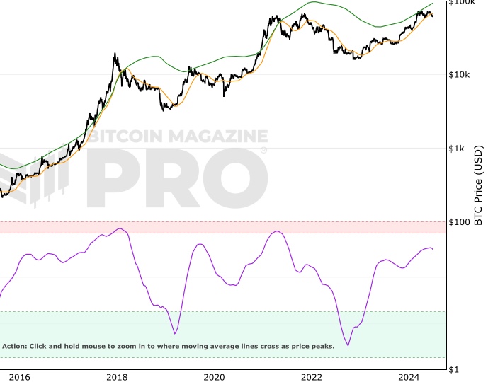
Pi Cycle Top & Bottom Indicator
Pi Cycle Top and Bottom Indicator.
Make smarter decisions about Bitcoin. Instantly.
Access the Bitcoin and Global Macro Charts that really drive Bitcoin’s price.
+40 chart alerts. Never miss critical levels on charts again.
Analysis newsletter. Manage your emotions at market extremes.
Private Tradingview indicators. See Bitcoin chart levels in real time!
Cancel anytime.
Any information on this site is not to be considered as financial advice. Please review the Disclaimer section for more information.