
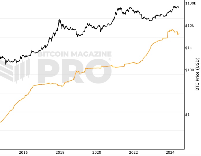
 Bitcoin: 1+ Year HODL Wave
Zoom in with touchscreen: Touch and hold with ONE finger then drag.
Zoom in on desktop: Left click and drag.
Reset: Double click.
Indicator Overview
1Y+ HODL Wave builds on work initially conducted by Unchained Capital.
HODL Wave data groups bitcoin by age since it was last moved from one wallet to another.
In this example we are looking at the percentage of all bitcoins that have not been moved from one wallet to another for at least 1 year.
This is a good example of blockchain analysis as we are looking at blockchain data to identify when bitcoins were last sent.
How To Use This Indicator
Looking at this specific 'age' is useful as certain movements in the percentage of 1yr HODL coins coincides with market cycle highs and lows of Bitcoin's price. The reasons for this are driven by market psychology i.e. the emotions of people holding the coins and deciding whether to sell or hold them, depending on where we are in the market cycle.
For example, we can see the proportion of 1yr+ coins decreases as price climbs up towards a new cycle high. This is, in part, due to people who have been holding onto coins for over 1 year deciding to cash in some profit, so they sell the coins and those coins are no longer classified in this analysis as 1yr+. Therefore the 1yr+ HODL (orange line) drops as price (blue line) increases.
Bitcoin Price Prediction Using This Tool
This tool analyzes a group of market participants over time to understand their behavior and identify their potential impact on Bitcoin price. In previous years we have seen that when long-term holders of Bitcoin move their coins en-masse (largely to realize their profits by selling them), it can forecast Bitcoin price reaching its major highs.
Created By
The original HODL waves concept was developed by Unchained Capital .
This specific view was created by Philip Swift .
Date Created
April 2019
Fall Further Down The Rabbit Hole
Similar Live Charts That You May Find Useful
Another live chart that looks at the extent to which groups of market participants are holding their coins vs. selling them is the RHODL Ratio live chart. The full HODL Waves live chart is also available.
You May Also Be Interested In
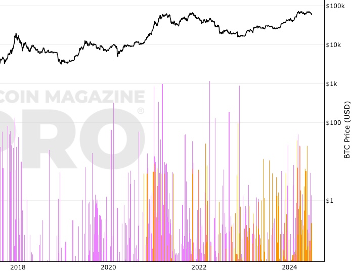
Whale Shadows (aka Revived Supply)
Onchain tracking of old coins moving again in large amounts.
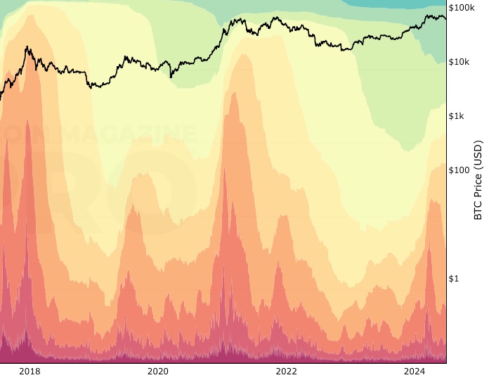
Realized Cap HODL Waves
The cost basis of UTXO’s held within specific age bands.
5+ Years HODL Wave
Bitcoin 5+ year HODL wave chart, showing percentage of bitcoin that has not moved onchain for 5+ years.
Make smarter decisions about Bitcoin. Instantly.
Access the Bitcoin and Global Macro Charts that really drive Bitcoin’s price.
+40 chart alerts. Never miss critical levels on charts again.
Analysis newsletter. Manage your emotions at market extremes.
Private Tradingview indicators. See Bitcoin chart levels in real time!
Cancel anytime.
Any information on this site is not to be considered as financial advice. Please review the Disclaimer section for more information.